DISCOUNT RIDE—
—
TITLE
Discount Ride
—
PURPOSE
Cab Company Rebranding
—
FOCUS
Identity / Logo Design
—
KEY WORDS
Bold, Clean, Fresh, Visible and Hip
—
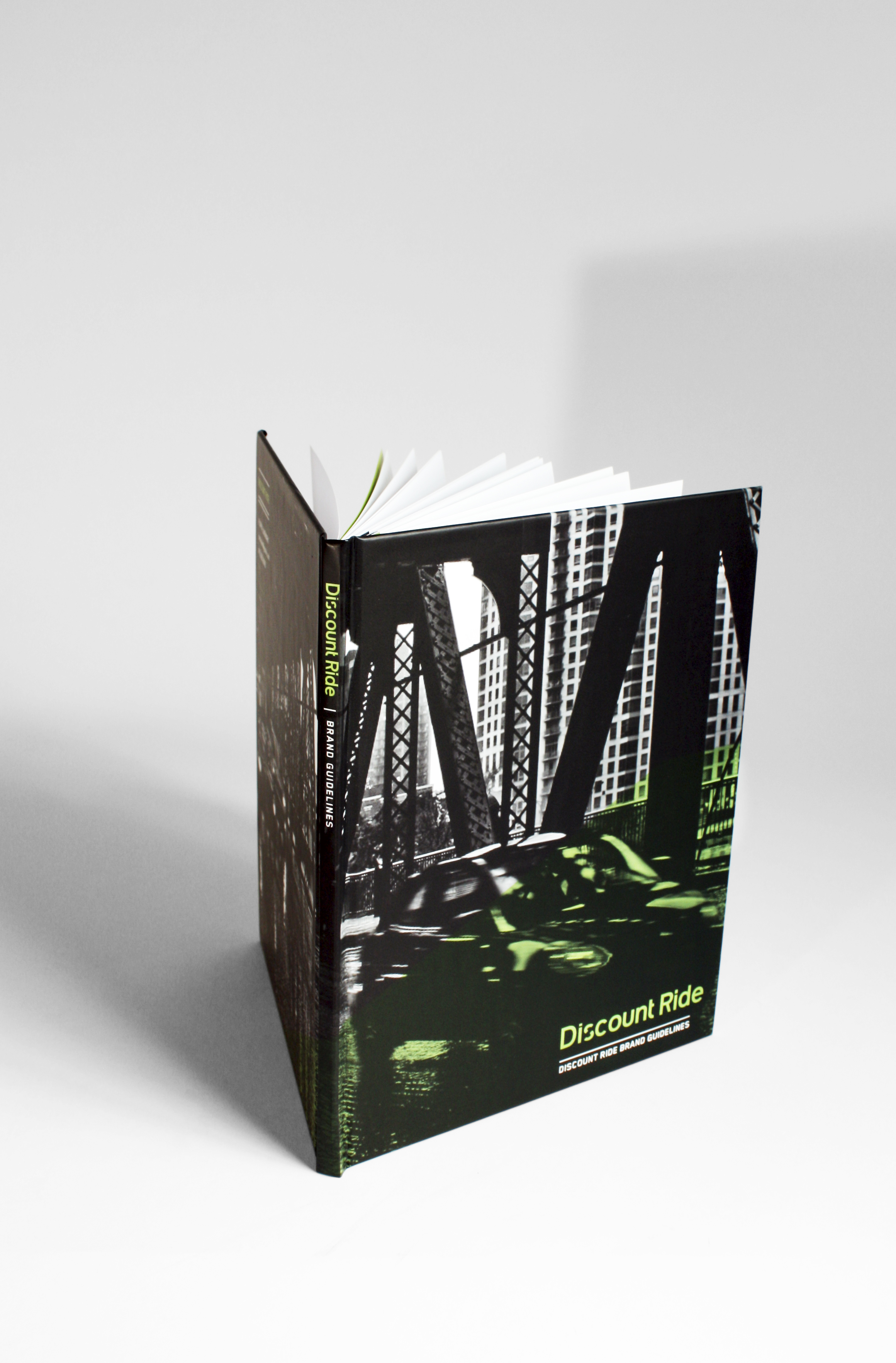
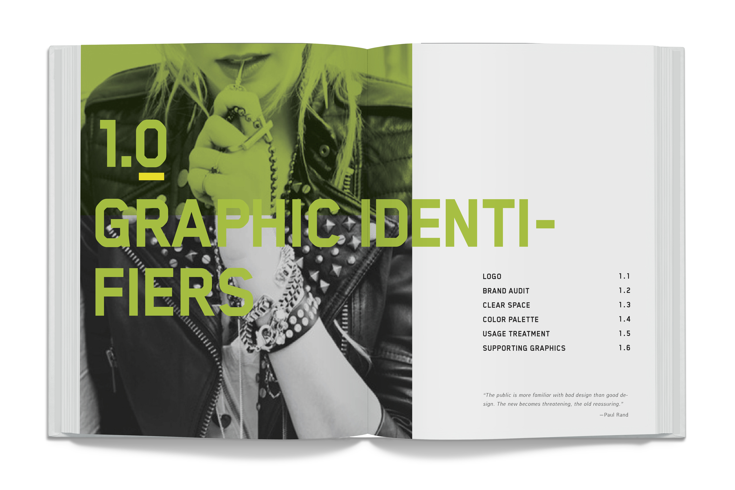
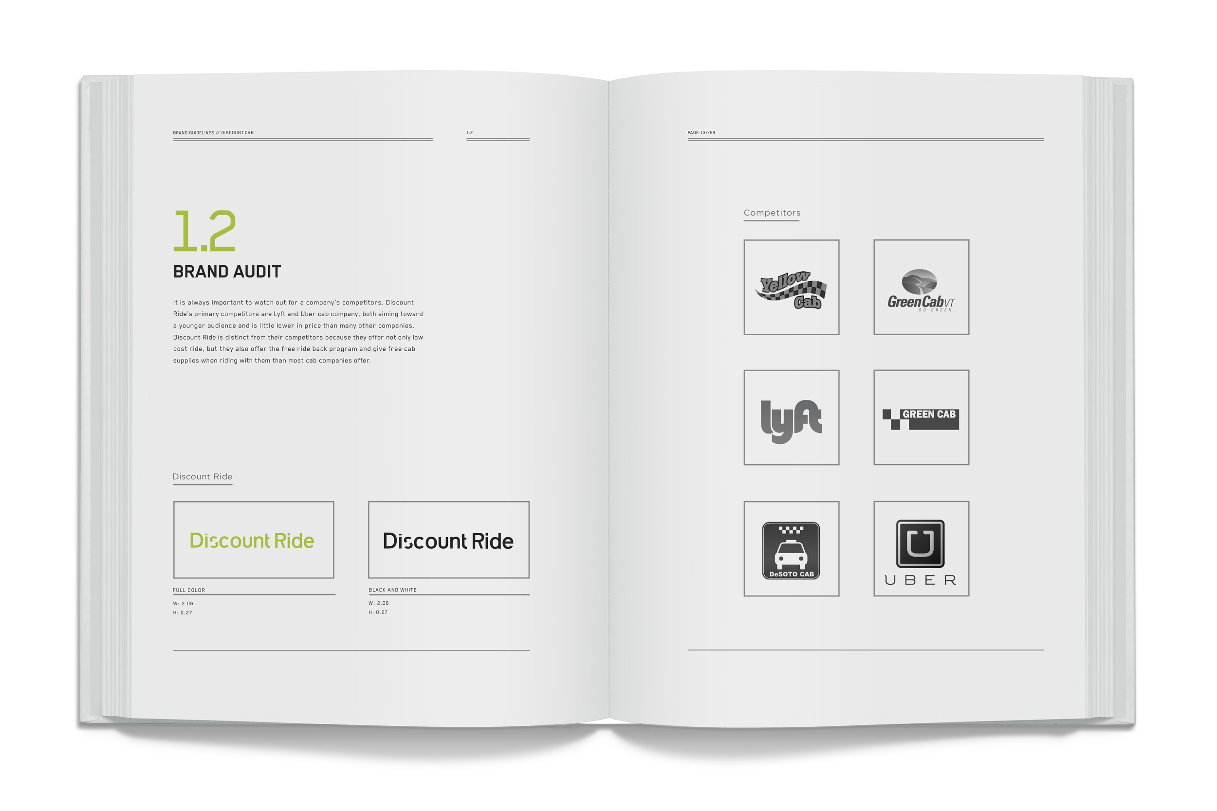
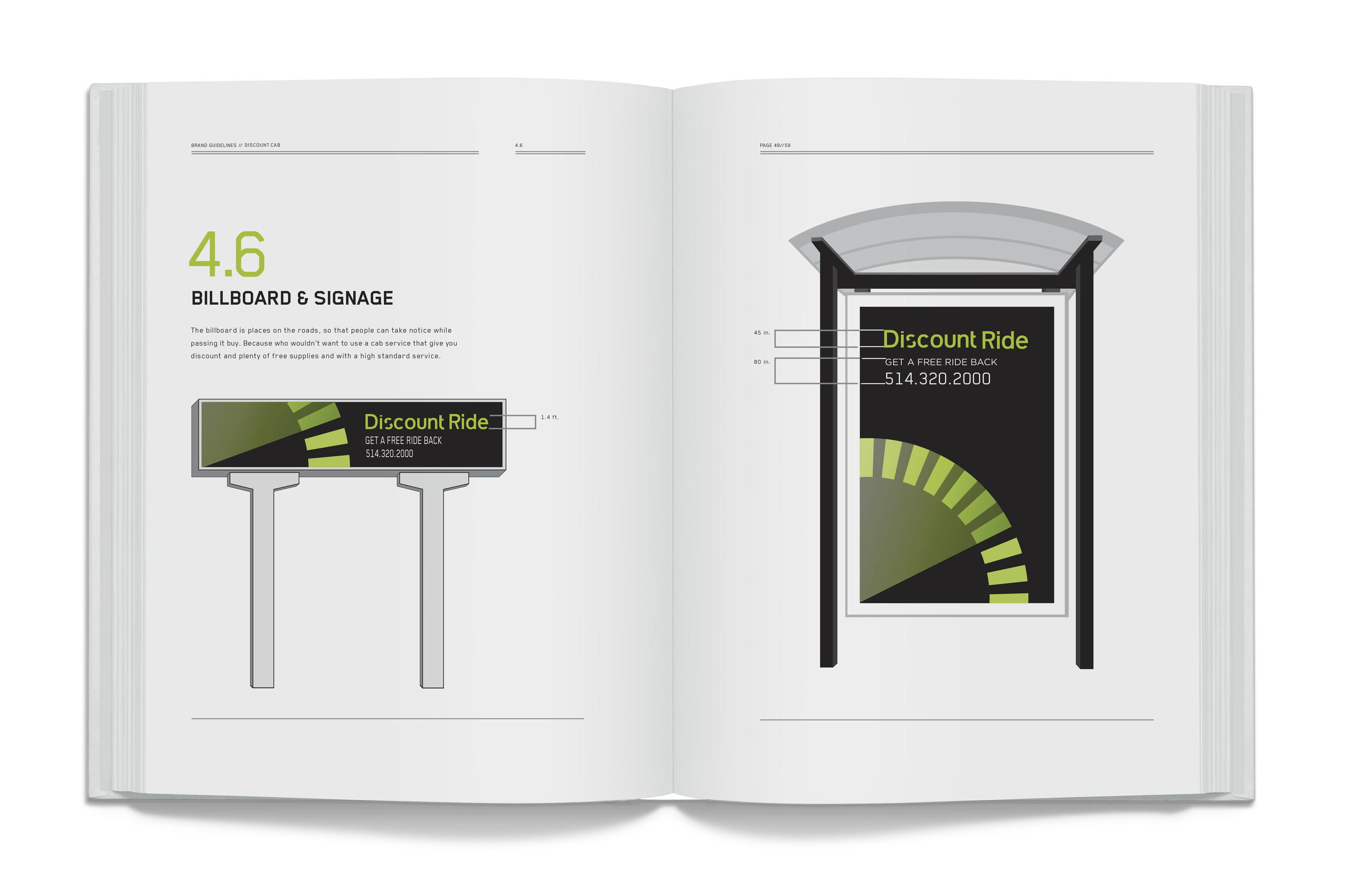
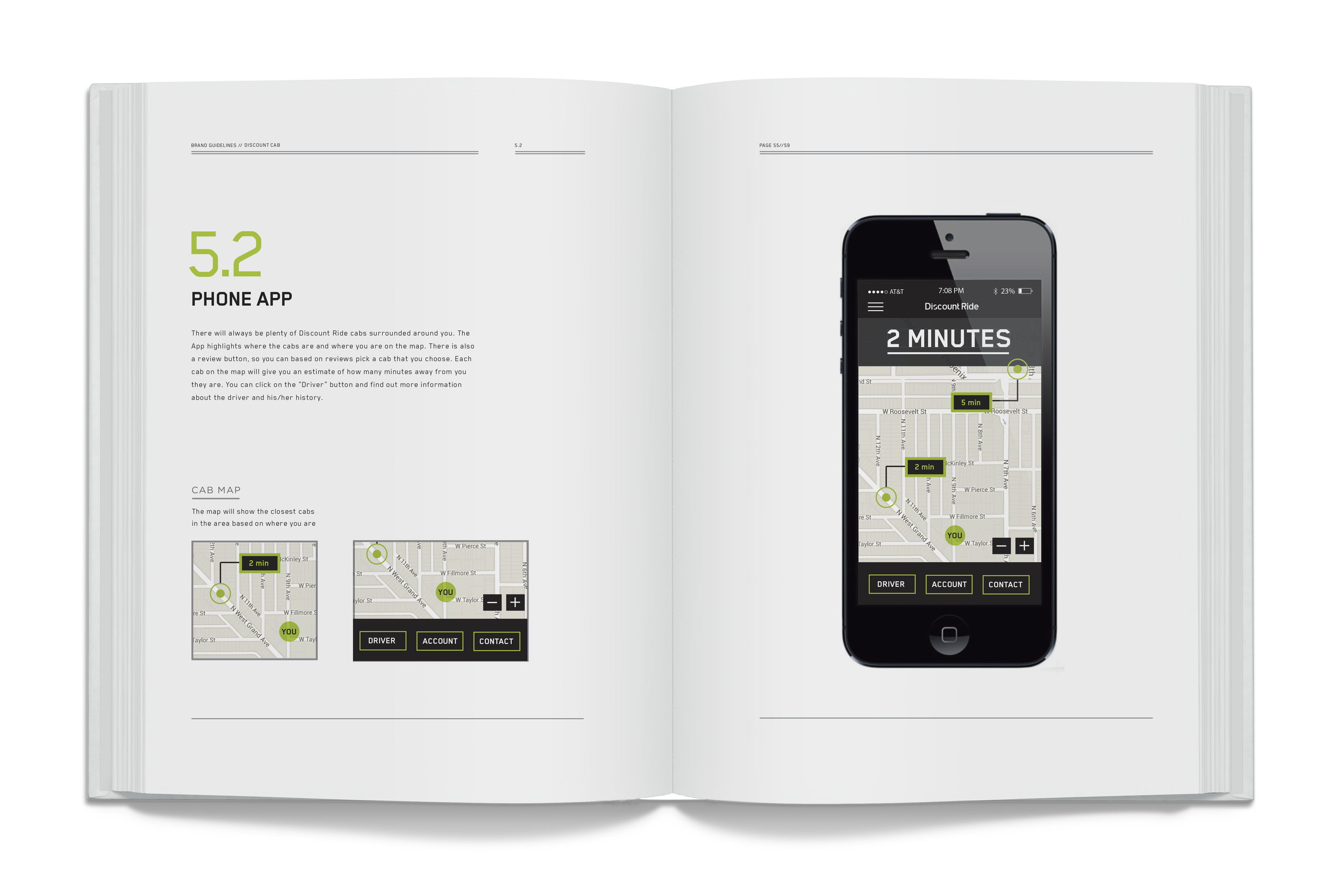
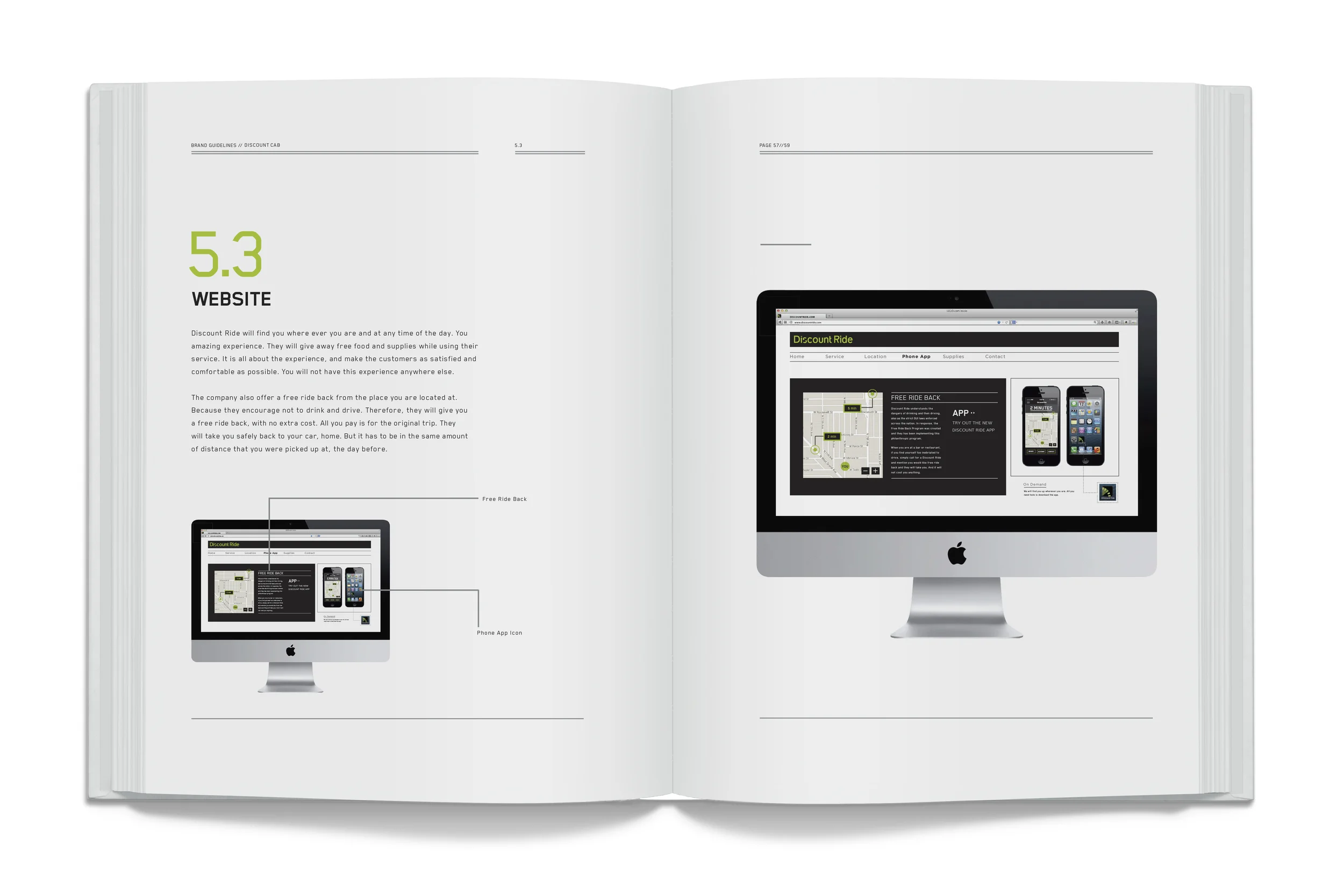
I wanted to pull out a strong personality when rebranding the American-based cab company Discount Cab. Their new name became Discount Ride. Discount Ride supports the young adults and students by not only giving out free stuff, but more importantly they are running the “Free Ride Back” program. Discount Ride understands the danger of drinking and driving. When you are at a bar or a restaurant, and you find yourself too inebriated to drive, you have the opportunity to call Discount Ride and you will have the option of getting a free ride back. They will drive you home safely and return you to your car the day after. You only have to pay for the original fare home.
—
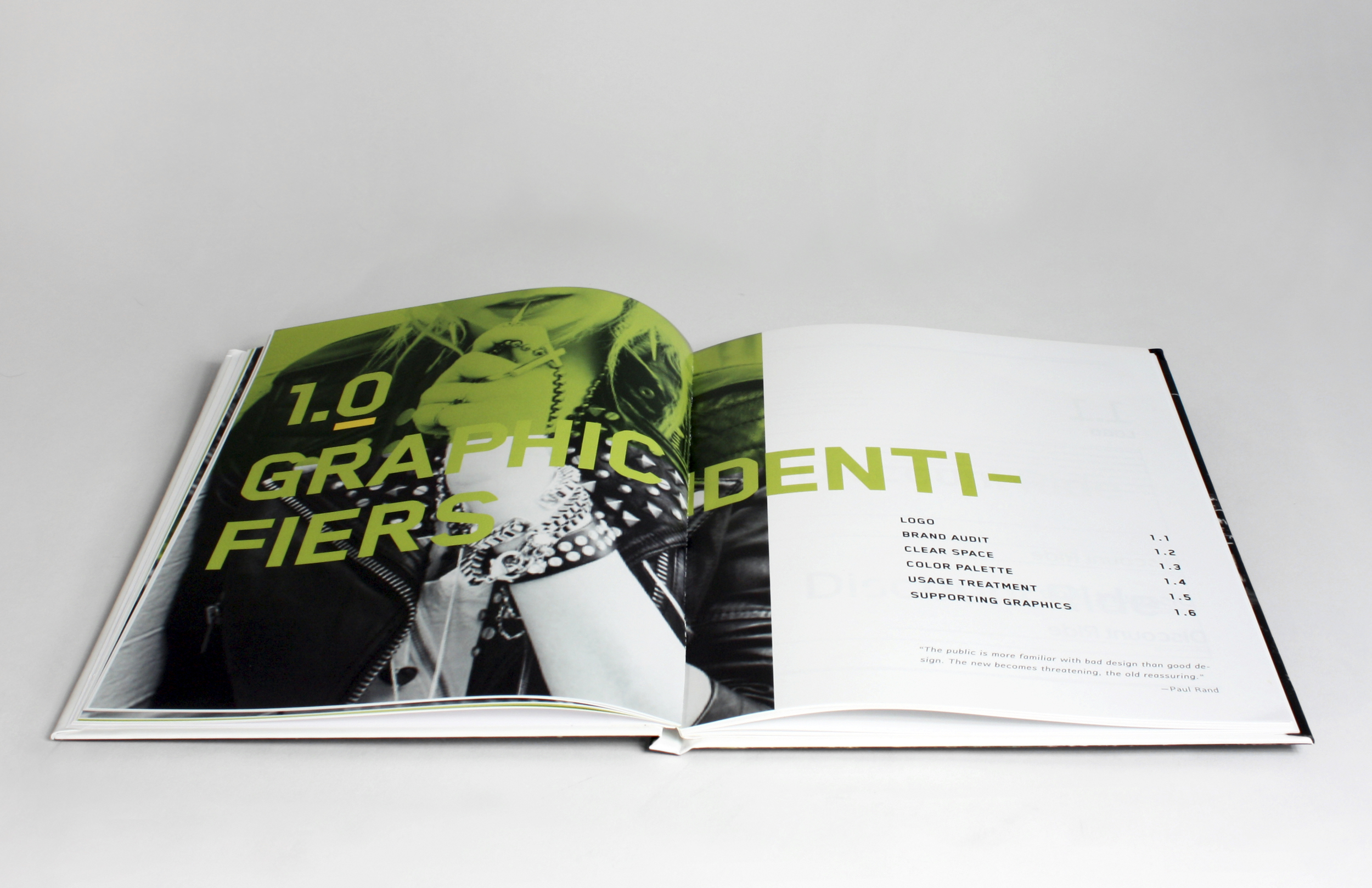
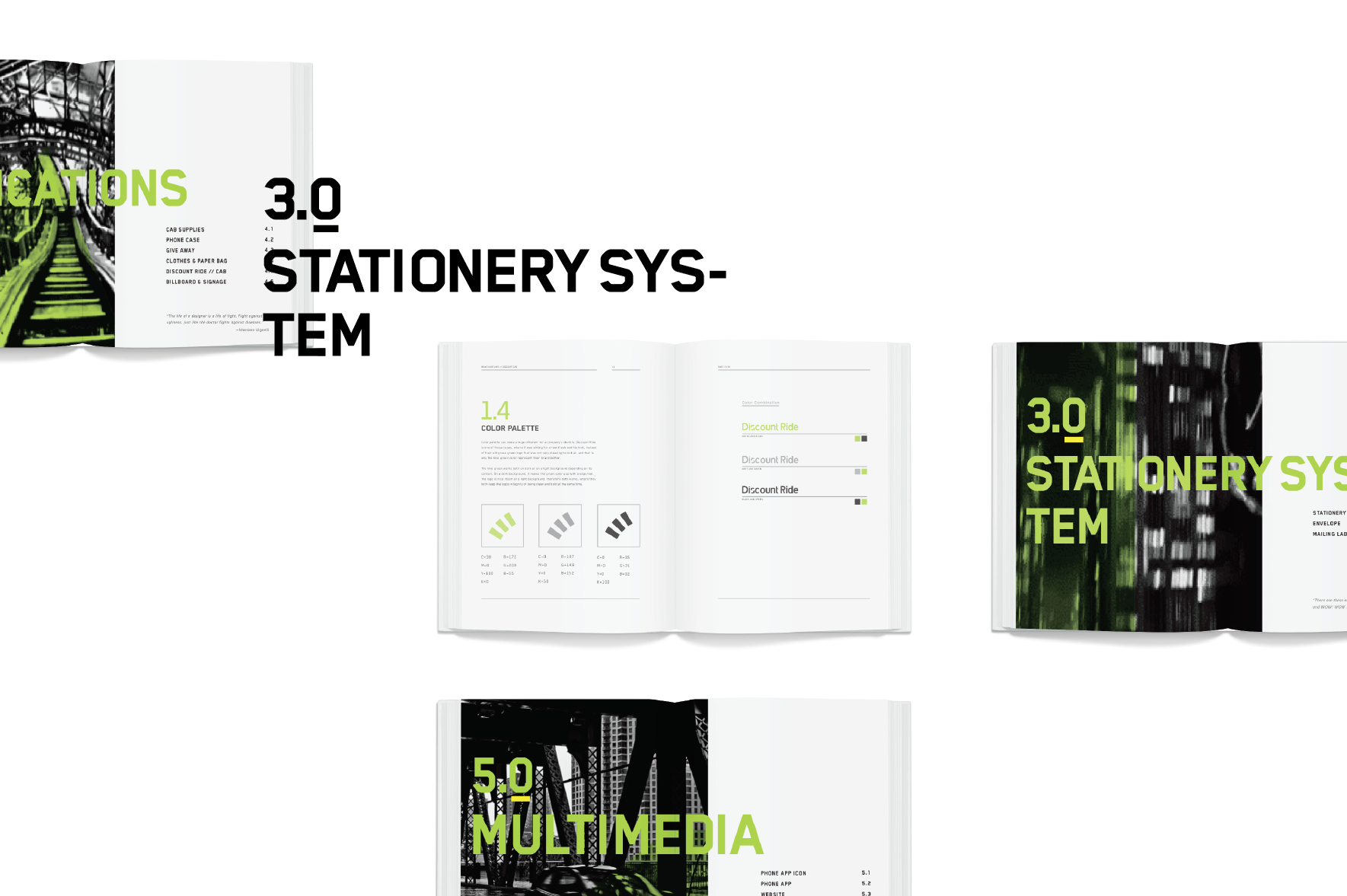
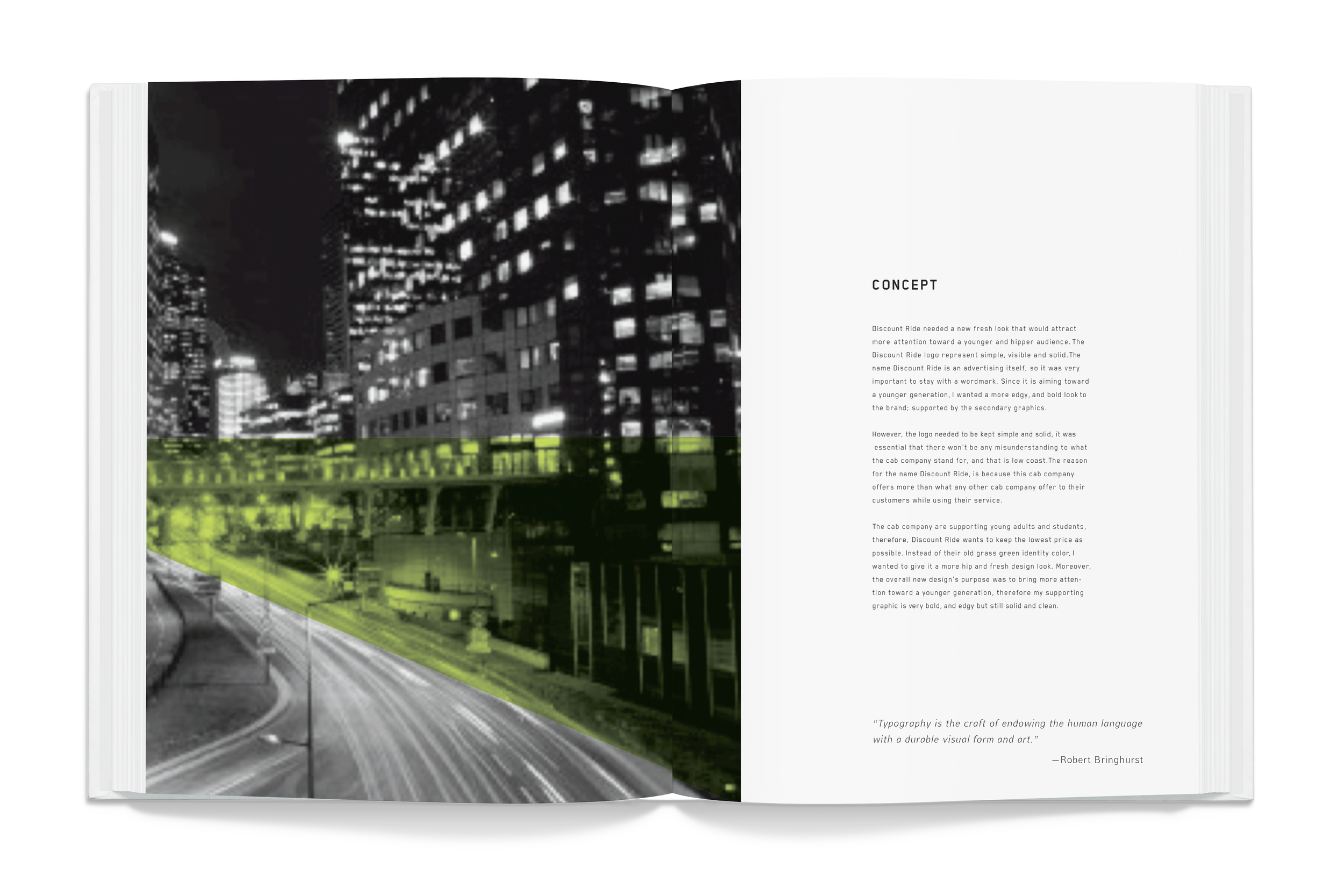
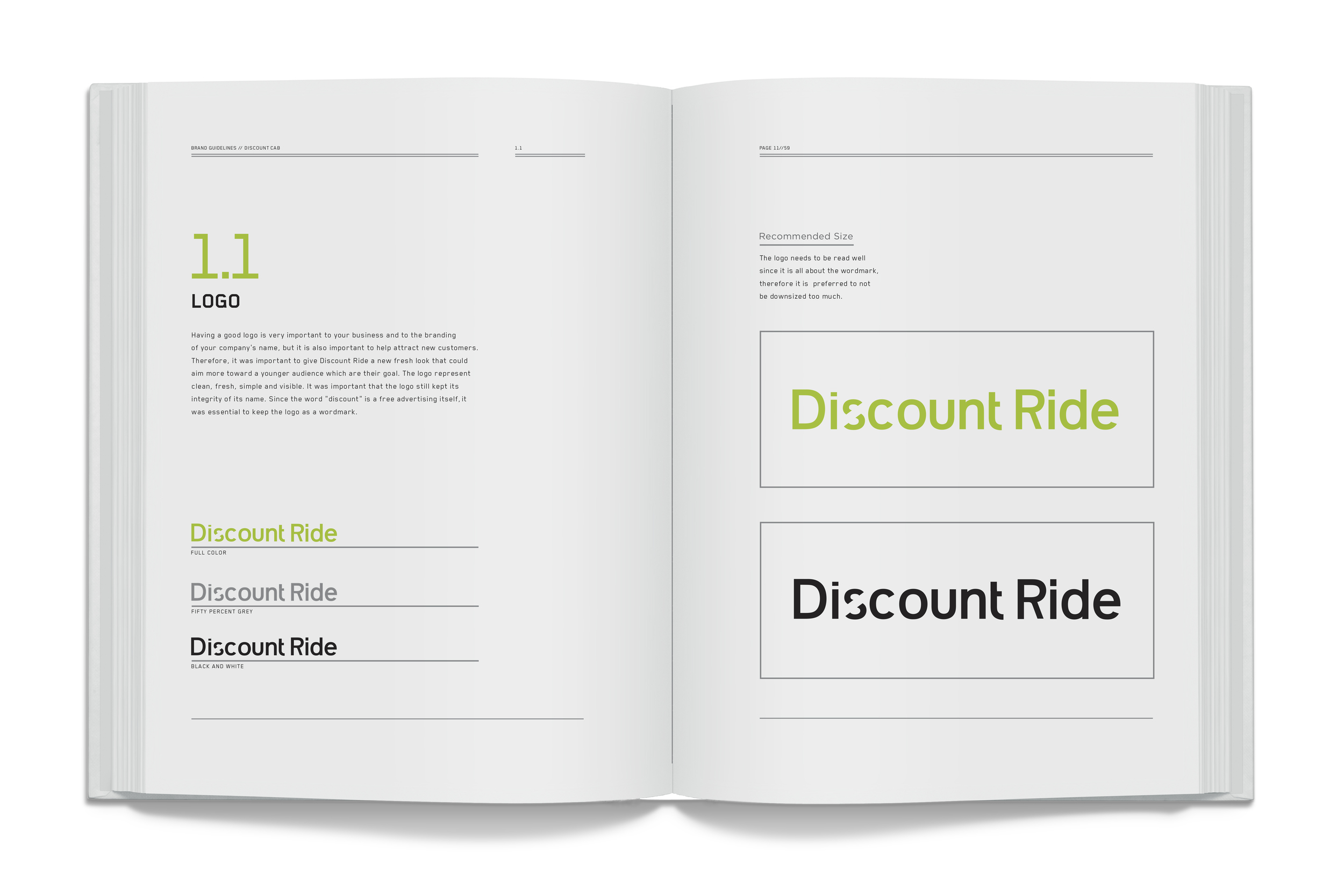
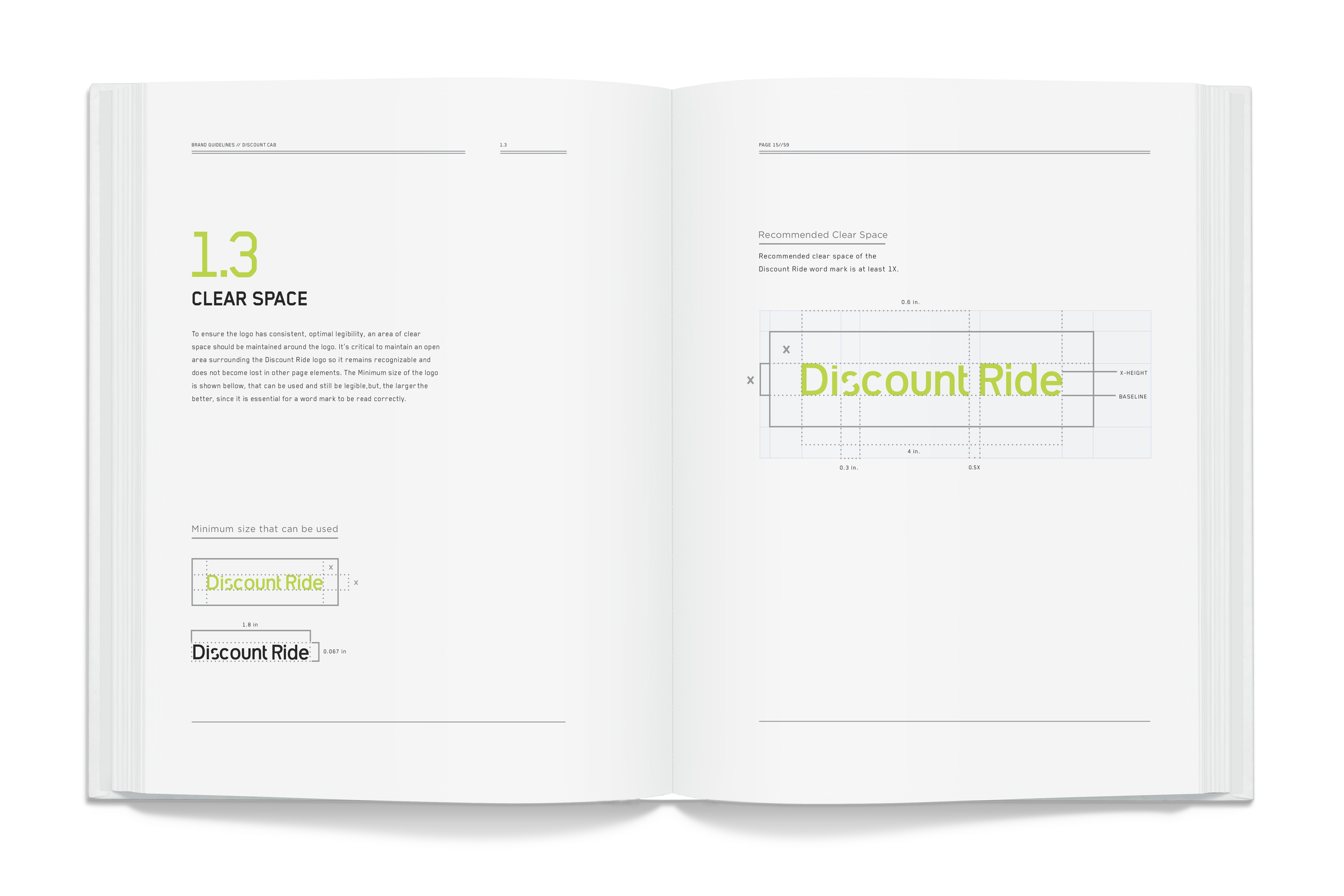
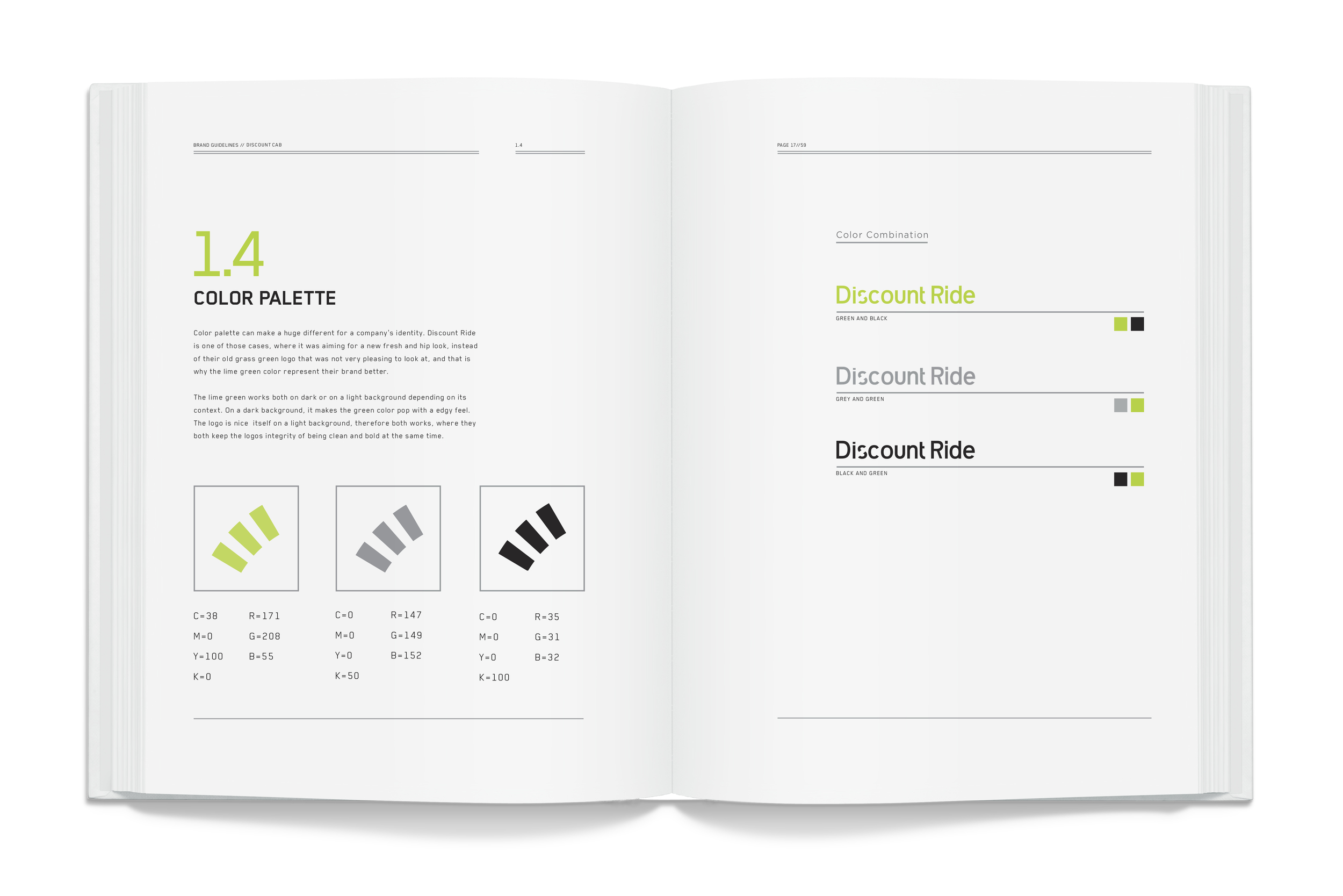
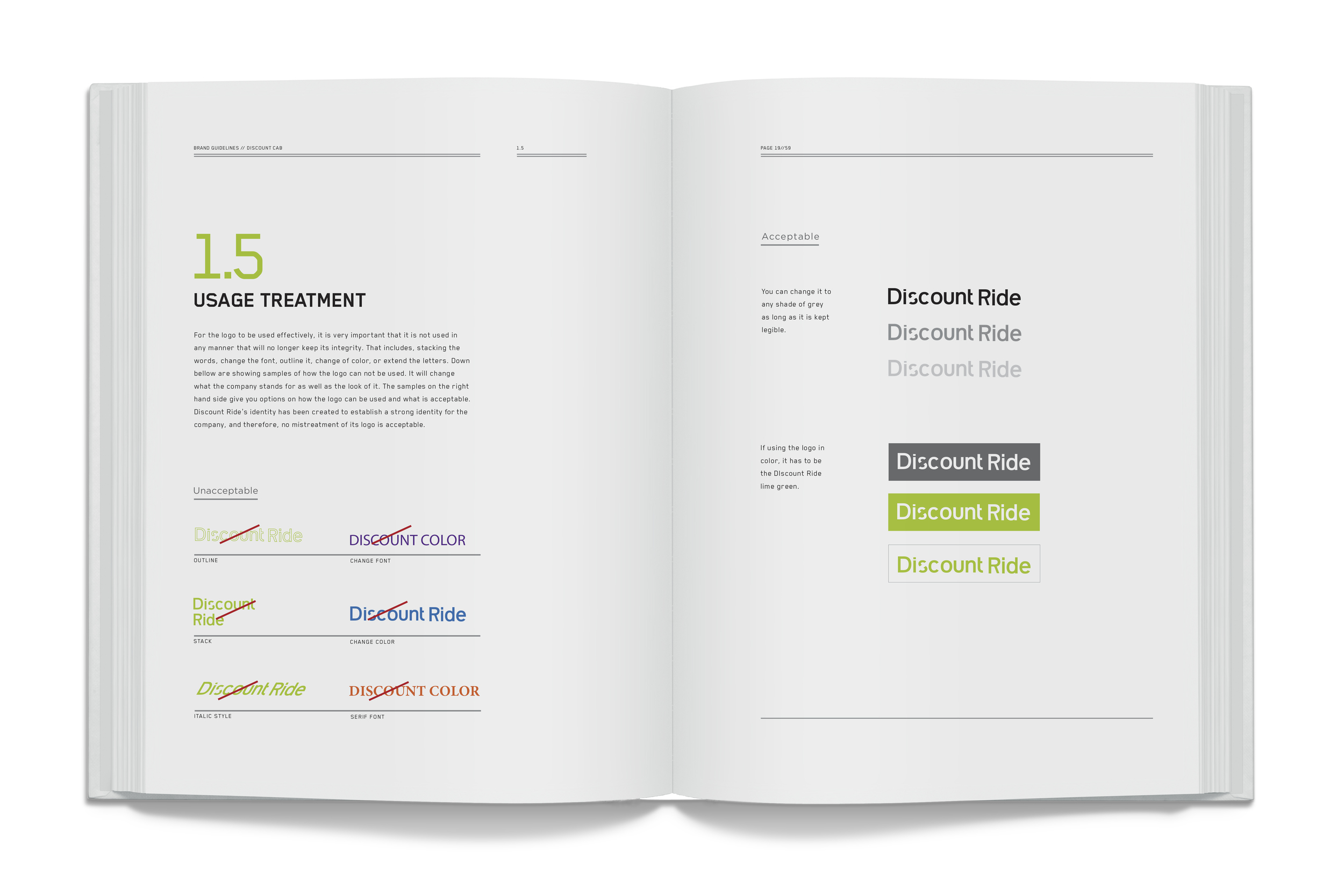
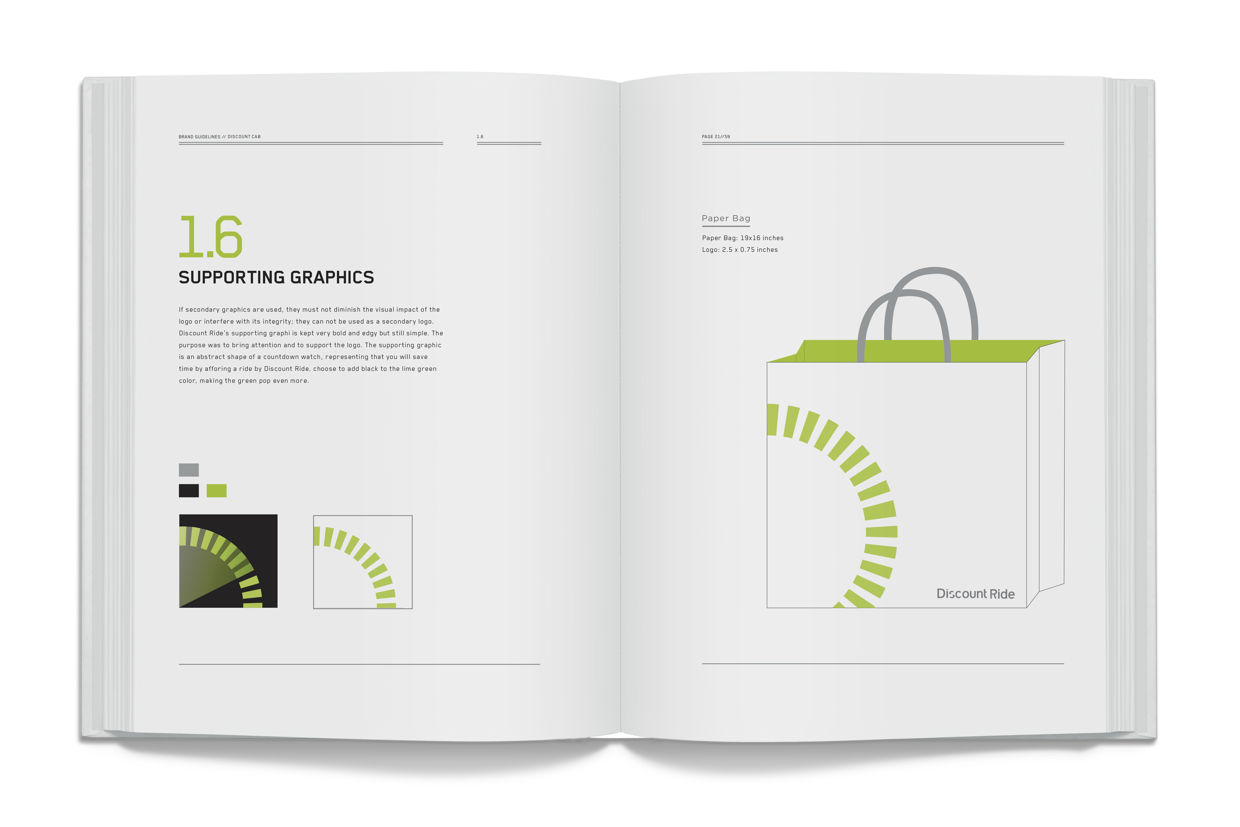
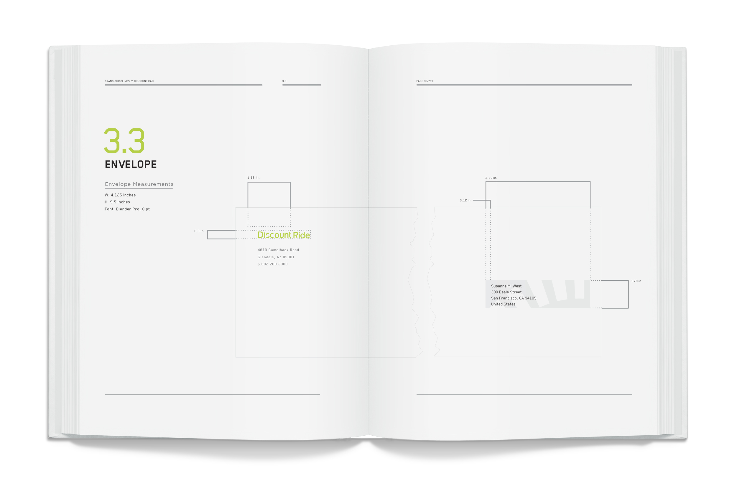
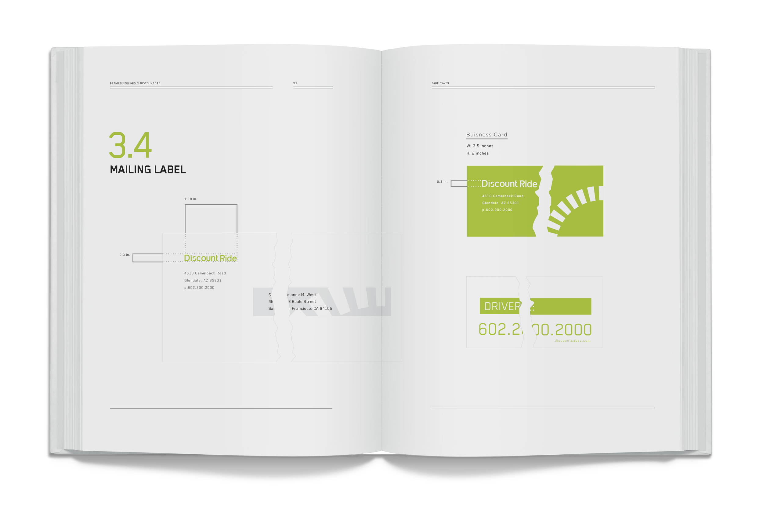
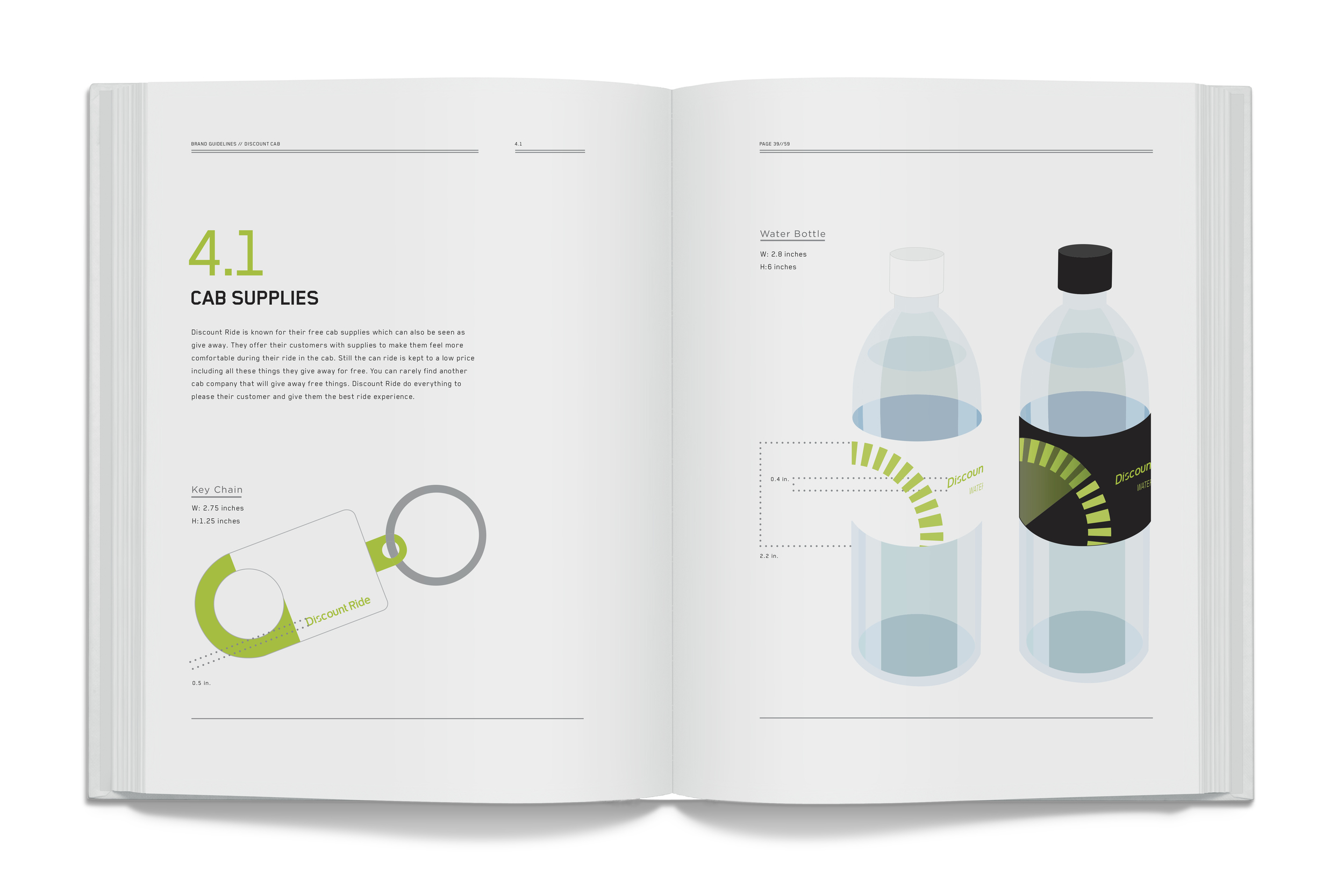
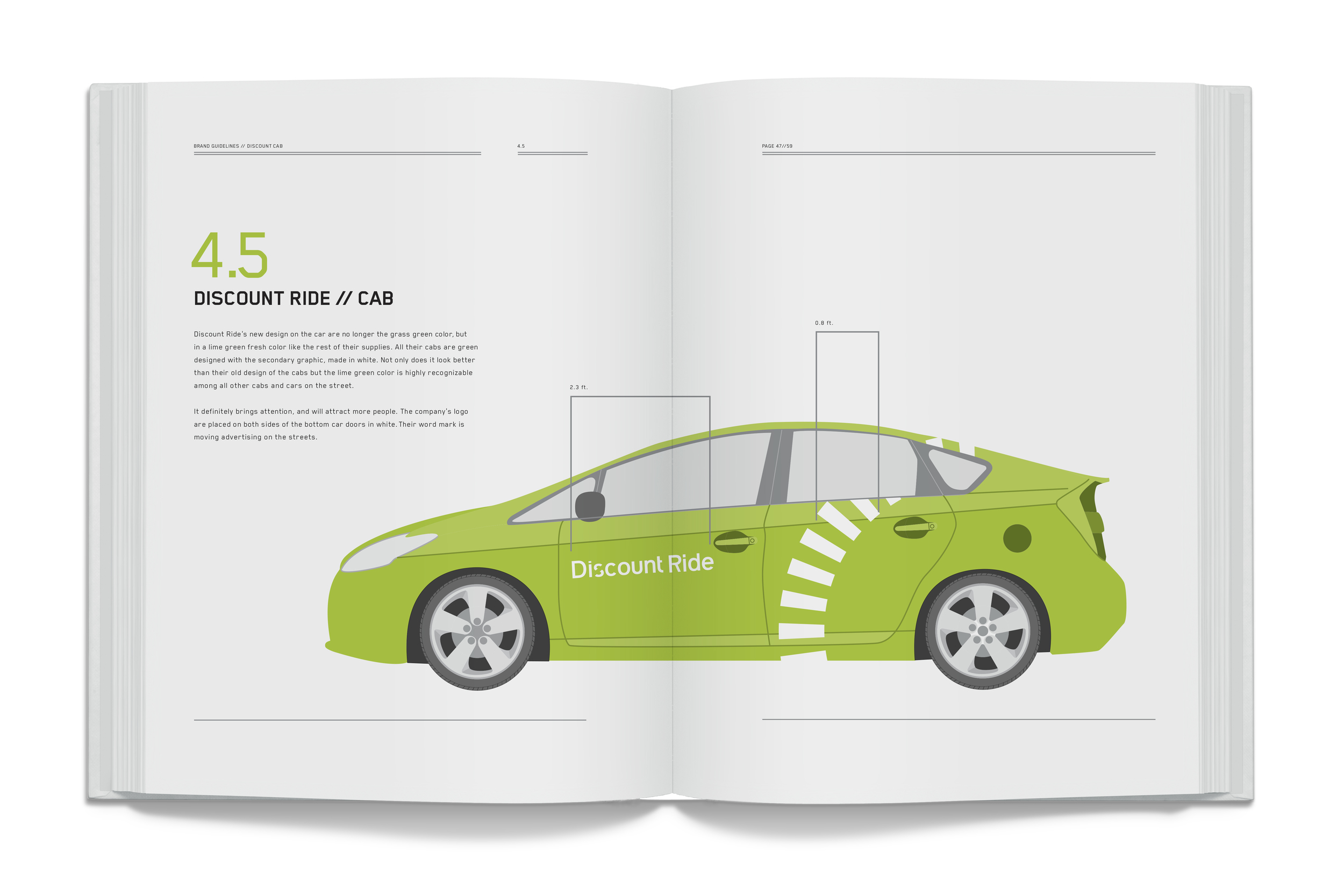
The new logo needed to be very simple, clean and solid. Since the name Discount Ride is an advertisement itself, it was essential to stay with a wordmark. Discount Ride needed a new fresh look that would attract more attention toward the younger and hipper audience. Therefore I wanted a more edgy and bold look. The old grass-green color was turned into a fresh lime green glow.
—
